Posted by Francesco Romano, Senior Developer Relations Engineer on Android

We are excited to announce a major milestone in bringing mobile and desktop computing closer together on Android: connected display support has reached general availability with the Android 16 QPR3 release!
As shown at Google I/O 2025, connected displays allow users to connect their Android devices to an external monitor and instantly access a desktop windowing environment. Apps can be used in free-form or maximized windows and users can multitask just like they would on a desktop OS.
Google and Samsung have collaborated to bring a seamless and powerful desktop windowing experience to devices across the Android ecosystem running Android 16 while connected to an external display.
This is now generally available on supported devices* to users who can connect their supported Pixel and Samsung phones to external monitors, enabling new opportunities for building more engaging and more productive app experiences that adapt across form factors.
How does it work?
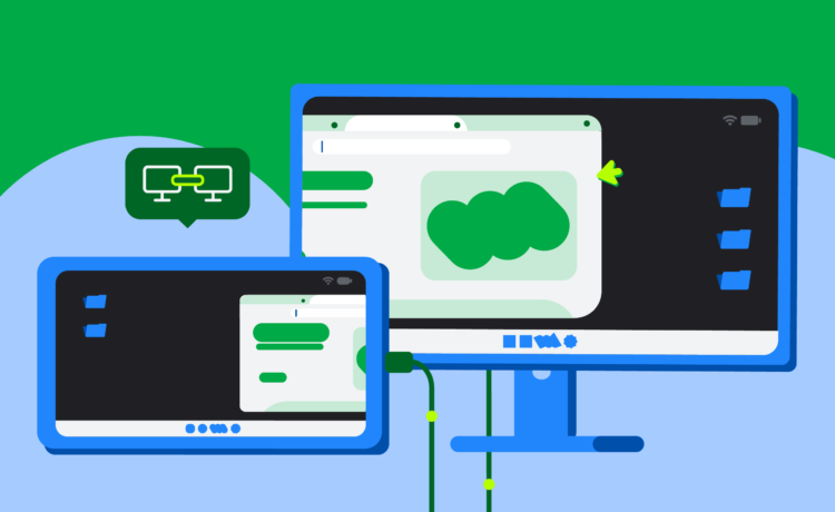
When a supported Android phone or foldable is connected to an external display, a new desktop session starts on the connected display.
The experience on the connected display is similar to the experience on a desktop, including a taskbar that shows active apps and lets users pin apps for quick access. Users are able to run multiple apps side by side simultaneously in freely resizable windows on the connected display.
Phone connected to an external display with a desktop session on the display while the phone maintains its own state.
When a device that supports desktop windowing (such as a tablet like the Samsung Galaxy Tab S11) is connected to an external display, the desktop session is extended across both displays, unlocking an even more expansive workspace. The two displays then function as one continuous system, allowing app windows, content, and the cursor to move freely between the displays.
Tablet connected to an external display, extending the desktop session across both displays.
In the Android 16 QPR3 release, we finalized the windowing behaviors, taskbar interactions, and input compatibility (mouse and keyboard) that define the connected display experience. We also included compatibility treatments to scale windows and avoid app restarts when switching displays.
If your app is built with adaptive design principles, it will automatically have the desktop look and feel, and users will feel right at home. If the app is locked to portrait or assumes a touch-only interface, now is the time to modernize.
In particular, pay attention to these key best practices for optimal app experiences on connected displays:
The biggest update in Jetpack WindowManager 1.5.0 is the addition of two new width window size classes: Large and Extra-large.
Window size classes are our official, opinionated set of viewport breakpoints that help you design and develop adaptive layouts. With 1.5.0, we’re extending this guidance for screens that go beyond the size of typical tablets.
Here are the new width breakpoints:
- Large: For widths between 1200dp and 1600dp
- Extra-large: For widths ≥1600dp

The different window size classes based on display width.
On very large surfaces, simply scaling up a tablet’s Expanded layout isn’t always the best user experience. An email client, for example, might comfortably show two panes (a mailbox and a message) in the Expanded window size class. But on an Extra-large desktop monitor, the email client could elegantly display three or even four panes, perhaps a mailbox, a message list, the full message content, and a calendar/tasks panel, all at once.
To include the new window size classes in your project, simply call the function from the WindowSizeClass.BREAKPOINTS_V2 set instead of WindowSizeClass.BREAKPOINTS_V1:
val currentWindowMetrics =
    WindowMetricsCalculator.getOrCreate()
    .computeCurrentWindowMetrics(LocalContext.current)

val sizeClass = WindowSizeClass.BREAKPOINTS_V2
    .computeWindowSizeClass(currentWindowMetrics)
Then apply the correct layout when you’re sure your app has at least that much space:
if(sizeClass.isWidthAtLeastBreakpoint(
    WindowSizeClass.WIDTH_DP_LARGE_LOWER_BOUND)){
    ...
	// Window is at least 1200 dp wide.
}
Build adaptive layouts with Jetpack Navigation 3
Navigation 3 is the latest addition to the Jetpack collection. Navigation 3, which just reached its first stable release, is a powerful navigation library designed to work with Compose.
Navigation 3 is also a great tool for building adaptive layouts by allowing multiple destinations to be displayed at the same time and allowing seamless switching between those layouts.
This system for managing your app’s UI flow is based on Scenes. A Scene is a layout that displays one or more destinations at the same time. A SceneStrategy determines whether it can create a Scene. Chaining SceneStrategy instances together allows you to create and display different scenes for different screen sizes and device configurations.
For out-of-the-box canonical layouts, like list-detail and supporting pane, you can use the Scenes from the Compose Material 3 Adaptive library (available in version 1.3 and above).
It’s also easy to build your own custom Scenes by modifying the Scene recipes or starting from scratch. For example, let’s consider a Scene that displays three panes side by side:
class ThreePaneSceneAny>( override val key: Any, override val previousEntries: List >, val firstEntry: NavEntry , val secondEntry: NavEntry , val thirdEntry: NavEntry ) : Scene { override val entries: List > = listOf(firstEntry, secondEntry, thirdEntry) override val content: @Composable (() -> Unit) = { Row(modifier = Modifier.fillMaxSize()) { Column(modifier = Modifier.weight(1f)) { firstEntry.Content() } Column(modifier = Modifier.weight(1f)) { secondEntry.Content() } Column(modifier = Modifier.weight(1f)) { thirdEntry.Content() } } }
In this scenario, you could define a SceneStrategy to show three panes if the window width is wide enough and the entries from your back stack have declared that they support being displayed in a three-pane scene.
class ThreePaneSceneStrategyAny>(val windowSizeClass: WindowSizeClass) : SceneStrategy { override fun SceneStrategyScope .calculateScene(entries: List >): Scene ? { if (windowSizeClass.isWidthAtLeastBreakpoint(WIDTH_DP_LARGE_LOWER_BOUND)) { val lastThree = entries.takeLast(3) if (lastThree.size == 3 && lastThree.all { it.metadata.containsKey(MULTI_PANE_KEY) }) { val firstEntry = lastThree[0] val secondEntry = lastThree[1] val thirdEntry = lastThree[2] return ThreePaneScene( key = Triple(firstEntry.contentKey, secondEntry.contentKey, thirdEntry.contentKey), previousEntries = entries.dropLast(3), firstEntry = firstEntry, secondEntry = secondEntry, thirdEntry = thirdEntry ) } } return null } }
You can use your ThreePaneSceneStrategy with other strategies when creating your NavDisplay. For example, we could also add a TwoPaneStrategy to display two panes side by side when there isn’t enough space to show three.
val strategy = ThreePaneSceneStrategy() then TwoPaneSceneStrategy()

NavDisplay(...,
  sceneStrategy = strategy,
  entryProvider = entryProvider {
    entry(metadata = mapOf(MULTI_PANE_KEY to true))) { ... }
    ... other entries...
  }
)
If there isn’t enough space to display three or two panes—both our custom scene strategies return null. In this case, NavDisplay falls back to displaying the last entry in the back stack in a single pane using SinglePaneScene.
By using scenes and strategies, you can add one, two, and three pane layouts to your app!
An adaptive app showing three-pane navigation on wide screens.
Checkout the documentation to learn more on how to create custom layouts using Scenes in Navigation 3.
Standalone adaptive layouts
If you need a standalone layout, the Compose Material 3 Adaptive library helps you create adaptive UIs like list-detail and supporting pane layouts that adapt themselves to window configurations automatically based on window size classes or device postures.
The good news is that the library is already up to date with the new breakpoints! Starting from version 1.2, the default pane scaffold directive functions support Large and Extra-large width window size classes.
You only need to opt-in by declaring in your Gradle build file that you want to use the new breakpoints:
currentWindowAdaptiveInfo(supportLargeAndXLargeWidth = true)
Getting started
Explore the connected display feature in the latest Android release. Get Android 16 QPR3 on a supported device, then connect it to an external monitor to start testing your app today!
Dive into the updated documentation on multi-display support and window management to learn more about implementing these best practices.
Feedback
Your feedback is crucial as we continue to refine the connected display desktop experience. Share your thoughts and report any issues through our official feedback channels.
We’re committed to making Android a versatile platform that adapts to the many ways users want to interact with their apps and devices. The improvements to connected display support are another step in that direction, and we think your users will love the desktop experiences you’ll build!
*Note: At the time the article is written, connected displays are supported on Pixel 8, 9, 10 series and on a wide array of Samsung devices, including S26, Fold7, Flip7, and Tab S11.