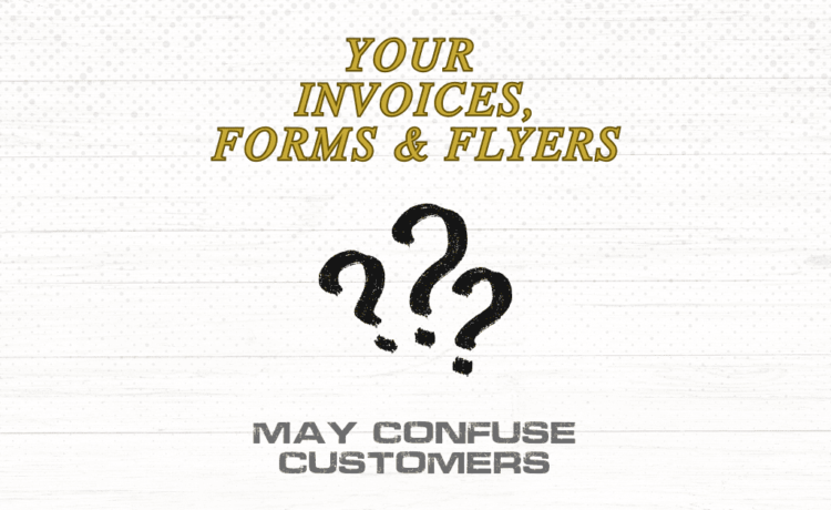
Many customer issues are blamed on attention, literacy, or attitude. In reality, confusion often starts with the document itself. Invoices, forms, and flyers fail when structure is unclear, information competes for attention, or layout does not guide the reader.
Confusing documents create delays, errors, and unnecessary back-and-forth. Clear design prevents those problems before they occur.
Why document clarity matters more than design style
Customers do not read business documents the way designers expect. They scan for meaning, sequence, and next steps.
When documents lack structure, customers hesitate, misinterpret information, or disengage.
What customers are trying to find quickly
What this document is
What action is required
Where key information is located
What happens next
If a document does not answer these questions immediately, confusion follows.
Too much information presented at once
One of the most common problems is visual overload.
How overload happens
Multiple font sizes competing for attention
Dense blocks of text with no spacing
Important details buried among secondary content
Logos and graphics overpowering information
When everything looks important, nothing is.
Poor visual hierarchy
Hierarchy tells the reader where to start and how to move through content.
Signs of weak hierarchy
No clear heading or title
Numbers and totals not visually distinct
Instructions mixed with legal or reference text
Equal emphasis on unrelated sections
Without hierarchy, customers guess instead of understand.
Inconsistent formatting across documents
Inconsistency forces customers to relearn how to read each document.
Common consistency problems
Different layouts for similar forms
Varying placement of totals, dates, or signatures
Changing terminology between documents
Inconsistent spacing and alignment
Consistency builds familiarity. Familiarity reduces errors.
Forms that do not follow natural reading order
Forms should follow the way people think, not internal processes.
Why forms confuse users
Fields appear out of sequence
Instructions come after fields instead of before
Related information is split across sections
Too many required fields without explanation
This leads to incomplete or incorrect submissions.
Invoices that do not clearly explain charges
Invoices often confuse customers even when pricing is correct.
Common invoice design mistakes
Totals not visually separated
Line items difficult to distinguish
Fees listed without context
Payment instructions buried at the bottom
Clear invoices reduce disputes and payment delays.
Flyers that try to do too much
Flyers often fail because they attempt to communicate everything at once.
Why flyers lose effectiveness
No single message or takeaway
Too many offers or calls to action
Poor balance between text and white space
No clear visual entry point
A flyer should guide attention, not demand it.
How structured design improves understanding
Clear documents are structured, not decorative.
Characteristics of clear business documents
Defined sections with visual separation
Consistent alignment and spacing
Readable type sizes and line lengths
Intentional use of emphasis
Predictable layout patterns
These elements help customers move through information confidently.
The operational cost of confusing documents
Confusing documents do not just affect customers.
They increase
Clarification emails and calls
Processing time
Data entry errors
Payment delays
Internal frustration
Clear design improves efficiency on both sides.
When document design should be reconsidered
If customers regularly ask questions answered in the document, the document is failing. If staff must explain invoices or forms repeatedly, design clarity should be revisited.
Closing
Invoices, forms, and flyers confuse customers when layout and structure do not support how people read and process information. Clear, structured design reduces friction, improves understanding, and builds trust without changing the message itself.
This type of clarity-focused design is often addressed by restructuring existing materials rather than creating something new, helping businesses communicate accurately and consistently.
Ronnie Lee Roberts II is a part owner and principal of R.L. Roberts II Design, LLC, a design and documentation studio focused on production-ready graphics and structured compliance materials. His background combines quality management, technical documentation, and professional graphic design, supporting work built for operational use rather than presentation alone. His portfolio includes sign shop overflow support, naval base maps and facilities graphics, home service company materials, and custom compliance documentation, along with work for mission-driven organizations such as The Arc and United Way. His work emphasizes clarity, consistency, and efficiency across print, digital, and regulated environments.