Get ready for another change to your IG profile display, with Instagram now preparing to move your Story highlights bubbles from above the profile grid, and into their own section within your profile tabs.

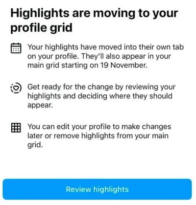
As you can see in this notification, shared by social media expert Lindsey Gamble, Instagram is now in the process of informing users that their Story highlights will be moving into a dedicated profile tab later this week, while they’ll also show in your main grid. Though where exactly they’ll be displayed in the main grid is not clear as yet (i.e. will they appear in the feed based on the date of the first or last update to the Highlight collection, or some other qualifier?).
The update has been in testing for some time.
Back in August app researcher Alessandro Paluzzi shared an example of the new profile grid display, with a dedicated Story Highlights tab.

As you can see in this image, the new Story Highlights tab will be signified by a rounded heart icon. Within that, all of your Stories highlights will have their own, vertically aligned thumbnail image, with a separate one for each topic.
Instagram chief Adam Mosseri recently explained the change, and what they’re trying to do be reforming Stories Highlights on profiles:
“We’re trying to figure out a way to improve the profile and get more of the content above the fold, and simplify it […] You will still have control, you can still pin things, there’ll be a dedicated Highlights tab, but we don’t need to have pogs and squares and have it be all complicated and pushing everything down.”
Didn’t realize that “pogs” had such a cultural impact on web design, but evidently, the current circular display of Story Highlights is called a “pog” at IG land.
In any event, Instagram is essentially working to simplify the profile display, and moving your highlights “pogs” is one way to do that, so it’s shifting them to their own tab below the main info display.
Which will certainly make things cleaner, but I suspect it will also see a lot fewer people tapping on your Stories highlights. But then again, I’m guessing most people don’t tap on these anyway, otherwise IG wouldn’t be considering moving them.
Maybe, Stories are meant to be ephemeral, and users haven’t found that much value in tapping through on your past updates, which are now largely out of date.
Or maybe Instagram just thinks this is better, but either way, it does seem like IG has now settled on a format for its updated display, and it’s now being rolled out to users.
We’ve asked Instagram for more info on this change, and whether it’s being rolled out to all users, and we’ll update this post if/when we hear back.


