With Halloween just days away, many of us are even now readying a scary movie or two to watch on the night itself. If you’re still undecided about your own Halloween viewing material, allow us to suggest The Shining, Stanley Kubrick’s “masterpiece of modern horror.” Those words come straight from the original poster hung up at theaters when the film was released in 1980, and presumptuous though they may have sounded at the time — especially considering the mixed first wave of critical reception — the decades have proven them right. Even if you’ve watched it for ten, twenty, forty Halloweens in a row, The Shining remains frightening on both the jump-scare and existential-dread levels, while its each and every frame appears more clearly than ever to be the work of an auteur.
One could hardly find a more suitable figure to represent the notion of the auteur — the director as primary “author” of a film — than Kubrick, whose aesthetic and intellectual sensibility comes through in all of his major pictures, each of which belongs to a different genre. Kubrick had tried his hand at film noir, World War I, swords-and-sandals epic, psychological drama, Cold War black comedy, science fiction, dystopian crime, and costume drama; a much-reworked adaptation of Stephen King’s novel, The Shining represents, of course, Kubrick’s foray into horror.
Despite the famously quick-and-dirty tendencies of that defiantly unrespectable cinematic tradition, Kubrick exercised, if anything, an even greater degree of meticulousness than that for which he was already notorious, demanding perfection not just on set, but also in the creation of the marketing materials.
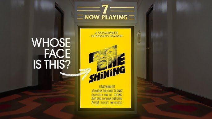
According to the new Paper & Light video above, famed designer Saul Bass (who’d previously created the title sequence of Kubrick’s Spartacus) did more than 300 drawings for The Shining’s movie poster. The only concept that met with the director’s approval placed a terrified, vaguely inhuman visage inside the lettering of the title. We don’t know whose face it’s supposed to be, but Paper & Light hazards a guess that it may be that of Danny, the young son of the Overlook Hotel’s doomed caretaker Jack Torrance, or even Danny’s invisible friend Tony. (Note the containment of all of its features within the T.) Though Kubrick credited Bass’ final design with solving “the eternal problem of trying to combine artwork with the title of the film,” The Shining’s bright yellow poster now sits somehow uneasily with the movie’s legacy, more as a curiosity than an icon. Nevertheless, it does evoke — and maybe too well — what we’ll all hope to feel when we press play this, or any, Halloween night.
Related content:
Saul Bass’ Rejected Poster Concepts for The Shining (and His Pretty Excellent Signature)
40 Years of Saul Bass’ Groundbreaking Title Sequences in One Compilation
Saul Bass’ Advice for Designers: Make Something Beautiful and Don’t Worry About the Money
Based in Seoul, Colin Marshall writes and broadcasts on cities, language, and culture. His projects include the Substack newsletter Books on Cities and the book The Stateless City: a Walk through 21st-Century Los Angeles. Follow him on the social network formerly known as Twitter at @colinmarshall.