Posted by Ivy Knight, Senior Design Advocate, Android

We’re thrilled to announce major updates to our design resources, giving you the comprehensive guidance you need to create polished, adaptive Android apps across all form factors! We now have Desktop Experience guidance and a refreshed Android Design Gallery.
New Desktop Experience Design Guidance
Your users are engaging with Android apps on more diverse devices than ever before—from phones and foldables to laptops and external monitors. A “desktop experience” occurs anytime your app is in a desktop-like mode, typically involving a non-touch input device like a keyboard or mouse, or another display such as a monitor (read more in the connected display announcement). This means designing for larger screens and accommodating additional input states. These new design experiences are meant to maximize productivity for your users with higher information density, multi-tasking capabilities.
Dive into desktop experience guidance to help optimize your app with desktop design principles, input interaction guidance, and system UI considerations.

The new guidance includes foundational guides where you can learn design principles that make desktop experiences unique, such as how multitasking is at the core of desktop experiences.

When your app is in a desktop experience, keep in mind crucial interaction experiences, such as how to best design around unique input interactions, like choosing cursors from system provided cursors.
For specialized actions not covered by system icons, consider creating a custom cursor icon, while ensuring it remains easy for users to find on the page.

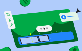
A desktop experience brings more multitasking features, like windowing, so expect your app to take on a variety of dimensions with a header bar.

Desktops have much larger screens than mobile, and users typically interact using a mouse which has finer precision than a finger on a touch screen. This means you can present a UI with higher information density so your users can be more productive!

Want to get started quickly? Check out the walkthrough to go from mobile to desktop and design along with the updated Adaptive Design lab.