
Image via The Frank Lloyd Wright Foundation Archives
Seen today, the Solomon R. Guggenheim Museum, designed by Frank Lloyd Wright, seems to occupy several time periods at once, looking both modern and somehow ancient. The latter quality surely has to do with its bright white color, which we associate (especially in such an institutional context) with Greek and Roman statues. But just like those statues, the Guggenheim wasn’t actually white to begin with. “Fewer and fewer New Yorkers may recall that the museum, in a then-grimier city, used to be beige,” writes the New York Times’ Michael Kimmelman. “Robert Moses thought it looked like ‘jaundiced skin.’ ” Hence, presumably, the decision during a 1992 expansion to paint over the earthen hue of Wright’s choice.
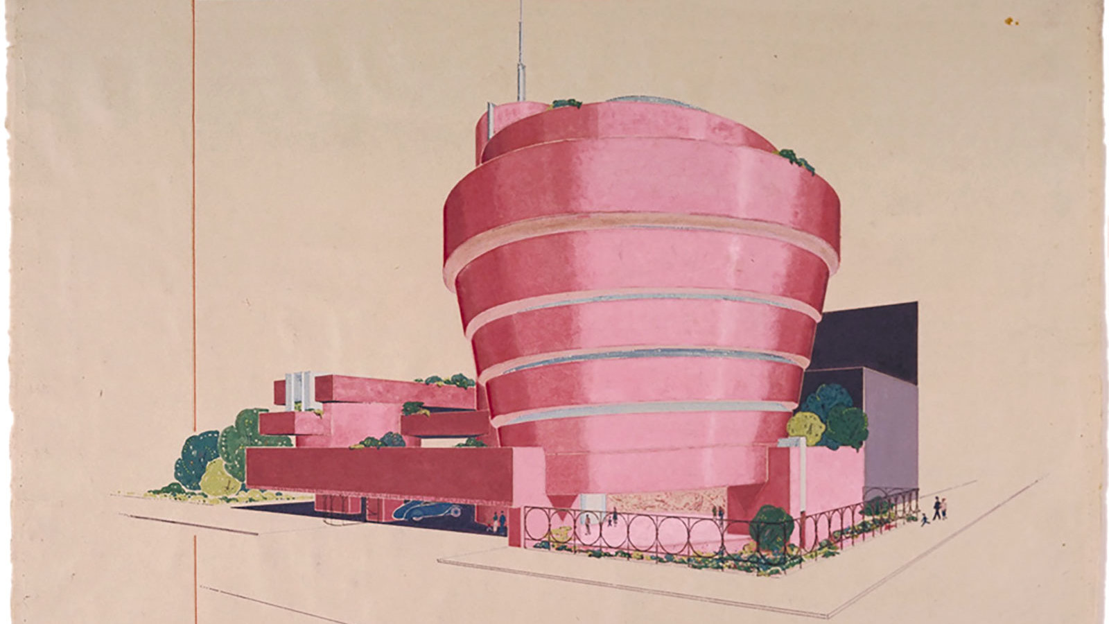
Not that beige was the only contender in the design phase. Look at the archival drawings, Kimmelman writes, and you’ll find “a reminder that Wright had contemplated some pretty far-out colors — Cherokee red, orange, pink.”
The very thought of that last “leads down a rabbit hole of alternative New York history,” and if you’re curious to see what a pink Guggenheim might have looked like from the street, David Romero at Hooked on the Past has created a few digitally modified photos. The result hardly comes off as being in taste quite as poor as one might expect; in fact, it could have fit quite well into the Memphis-embracing nineteen-eighties, and even the postmodern nineties. The image above, showing the Guggenheim imagined in pink, comes from The Frank Lloyd Wright Foundation Archives.
But as it is, “closed off to the city around it, the building’s antiseptic, spanking-white facade, today is in keeping with the neighborhood.” That itself is in keeping with Wright’s ideas for transforming the American city, which he kept on putting forth until the end of his life. Attempting to solve “the problem of the inner city,” he conceived “fantastical megastructures for places like downtown Pittsburgh, Baghdad, and Madison, Wisconsin,” all of them “city-based but anti-urban projects, divorced from the streets.” Even working in the United States’ densest metropolis, Wright expressed a longing for the splendid isolation of the American countryside, where a man — at least as the lore has it — can paint his house any color he pleases.
via Messy Nessy/Hooked on the Past
Related content:
Frank Lloyd Wright Designs an Urban Utopia: See His Hand-Drawn Sketches of Broadacre City (1932)
Behold Ancient Egyptian, Greek & Roman Sculptures in Their Original Color
The Guggenheim Puts 109 Free Modern Art Books Online
Based in Seoul, Colin Marshall writes and broadcasts on cities, language, and culture. His projects include the Substack newsletter Books on Cities and the book The Stateless City: a Walk through 21st-Century Los Angeles. Follow him on Twitter at @colinmarshall or on Facebook.


